By Picturepark Communication Team • Mar 15, 2018
Today, Picturepark® launched its new brand identity which marks the beginning of a change in its market positioning from purely Digital Asset Management (DAM) to more transactional “Content Routing”.
The rebranding project was started with first agency trials in mid 2017 but eventually, Picturepark decided to move off the beaten track and contract this important project with an international freelance network of design artists, led by Camil Haemmerli, a Swiss graphic designer and his partner, Polina Okean, a Russian illustrator.
We’ve interviewed both for what they experience as challenges for brand identity projects and their design work in general.
Now in its 18th year, Picturepark is an established international brand. What’s been your main challenge when tasked with the development of a new brand identity?
Camil: The redesign for Picturepark was a challenging task in the sense that we were not creating a Corporate Design for a startup but rather had to revise and evolve a brand that is already established in the market. The company has strong core values and it’s in the process of reinventing itself, and the DAM industry. The goal was to transform those underlying core principles into a visual foundation that will evolve with the brand over the next decades.
Polina: From the illustration-side, to be given complete freedom to invent a new visual language from the ground up which can be adapted to the various needs of the company. It was not just to create some nice looking illustrations for the home page. Usually I get briefings from clients that want me to do something in the style of an already existing brand which is often even not their own.
What have been your guiding principles when defining the new logo and brand?
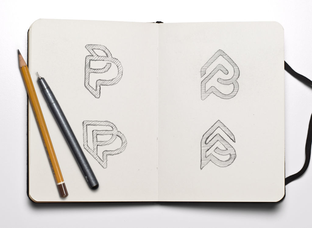
Camil: For the concept of the logo, our main target was to find a simple sign which represents the content routing aspect, a main principle of the new Picturepark Content Platform. The idea was to represent data flowing from outside through Picturepark where it takes shape, and play with the notion of metadata layers, all forming the double P as a single entity. Further to that and contrary to most logos, the sign has no closed forms which denotes the “API first” platform approach of the new Picturepark Content Platform.
Switzerland, Picturepark’s country of origin, is renowned for graphic and font design. What’s Swiss in the new logo?
Camil: The logo looks modern with a timeless monoline-style that is almost of “heraldic” quality. It’s simplicity and the bold use of lines in the sign are both characteristic of modern Swiss design to me. That said, Swiss design today has a tendency to be very colorful which Picturepark isn’t by its DNA – so that’s different. However, we don’t care too much about a particular style, all that counts is the outcome, and here we’re pretty proud of the result with the new Picturepark brand identity. Honestly, I’d want to wear the Picturepark sign on a T-shirt and I can’t wait to get mine!
Where do you get your ideas and inspiration from?
Polina: From everything in nature and architecture that I cross when traveling the world. I look at all those objects and memories as an infinite library which helps me combine elements to find new visual ways. My illustrations are often organic forms, simplified into clean vector shapes.
Camil: My inspiration comes much more from human beings that surround me, in the physical world but also in the realm of social media. Any such social interaction shapes my next moves.
What’s, in your view, the next big trend in graphic design?

Polina: In a broad sense it is clearly a shift towards motion design. Whereas in the past graphic design was seen as working on static layouts, the lines between graphic and motion design are blurring. It gets harder to stand out with non-moving illustrations, even if executed meticulously. Logos, illustrations, design portfolios and social media promotion pieces are becoming all animated.
Camil: Another trend in the design processes is a shift from traditional client-agency relationships over many years to working in project teams that change over time and as needed. This sounds easier than it actually is because the understanding a good agency develops from a client over the years cannot just be replaced by different freelancers for every job. I think companies need to address this by staffing or developing strong brand advocates within the company which are open enough to work with a changing team of freelancers which translate the corporate vision into appealing visual outcomes which change more frequently than ever before.
Today’s world is dominated by content that’s restlessly communicated over all channels, ever more personalized but not really “personal”. What’s your advice for companies to stand out?
Camil: There is no recipe for that because if there was, nothing would be outstanding anymore. Most important is to be courageous, open minded and trustworthy in communication with stakeholders. “Being authentic” is key today, given the flood of information, of which much is fake. “Being human” is another key differentiator in a highly commercialized and increasingly robotically regulated life.
What design tools do you use, and why?
Camil: I still like to rely on my sketchbook for conceptual work. In software, I see a shift from the decade-long monopoly of Adobe to fresh and new competitive apps that appear every week or so. I try to balance between both categories but when away from the computer my weapon of choice is still a spray can.
Polina: The love for vectors has accompanied me since forever but I’m evolving along the task at hand. I like the contrast of manual and digital techniques for personal work. For example, I often sketch on my iPad and then recreate it with a spray can on a wall or with markers on a canvas.

How do you manage your creative collaboration process, store your files and exchange them with clients?
Polina: For quick exchange, chats and images between the two of us we often use telegram. A well made messenger that has a lot of features that the more popular whatsapp is missing. First and foremost a much better desktop experience and the capability of sending large files instantly. For the work with clients, we use Google Drive and Docs.
You’ve worked both, employed and as a freelancer. Which mode of working gives you more freedom for creative projects?
Polina: I like to organize my day independently. If I feel stuck on a task, I don’t want to force myself to continue working on it without having a proper amount of inspiration – I better leave my workplace for a stroll and come back with a cleared head.
Camil: I like working as a freelancer too. Nonetheless, sometimes I miss having other creative professionals for a face to face discussion in the same room which can be a good motivator, providing inspiration and learning new stuff. However, partnering with Pollina in personal and work life, and not needing to draw a line between both, is an ideal situation and string vote for staying a freelancer within a virtual network.
You’re travelling the world as a design nomad, often working remote. What will you do next?
Camil: I’m an embarrassingly spontaneous person and a such, I often couldn’t say where I’ll be in a year from now. Maybe going to Colombia after a summer in St. Petersburg?
Polina: I thought we agreed on Bali – which would provide some new inspiration for our work! Wherever we go, we’ll work for our customers as committed as if we’re onsite.
 Camil Haemmerli (Website) studied Graphic Design at the ECAV in Switzerland and worked independently and in agencies around the world. Camil originates from and currently lives in Aarau, Switzerland. |
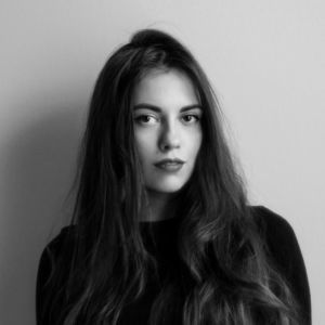
 Polina Okean (Behance) studied Design Strategy at the Stieglitz University of Arts and Design and works as a freelance illustrator with various Russian and international agencies. Pollina lives in St. Petersburg, Russia. |
